Logos and Branding •
Hollickwoodstock (Festival logo design ) - England loves a good garden. England loves good music in the summertime. A well-known family in North London posed the rhetorical question ‘Why not combine these two and throw in a few lucky feet for good measure!?’ And lo, Hollickwoodstock was born.
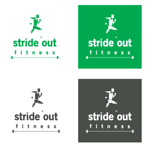
Stride out fitness (Corporate Identity for Personal Trainer) - The vague brief which listed ‘green, white and charcoal’ demanded I don my thinking cap and thinking sweat bands to represent the trainer’s passionate approach to building fitness and technique through knowledge, practice and diet as being like blocks stacked to form a formidable figure.

Hollickwoodstock - logo 1

Hollickwoodstock - logo 2

Hollickwoodstock - logo 3

Stride Out Fitness - logo on various colours

Stride Out Fitness - business card

Stride Out Fitness - web header


